
Falling for Orange: Design Color Crush
Fall color is all around, and today we wanted to give some much-deserved love to orange -inspired design. While we don't always think of this hue as a traditional staple of the home design color palette, orange can be so much more than just an October one-off. When placed with creativity, art, and skill, it's a design bombshell that can bring glamour and glow to any space.

Orange throw pillow - Cat French Design Chapel HIll
Creative Color, Artist- Style
This is the perfect time to talk about a really special past project. Although we show some selected scenes from it here and there, we haven't blogged about it in a long while, and over the years it's become a tried-and-true beloved favorite among the CFD client community. A little bit of backstory here- this was actually one of Cat's earliest residential projects, right out of graduate school. It was a large redesign of a gorgeous classic home in a charming historic neighborhood. We call it "The Artists' Retreat" because Cat designed the full house interior as a beautiful, synergistic fusion of style for a well-known artist in the community, and her partner who was a talented musician. As with all of the CFD designs, it's inspired by the personalities and passions of the homeowners themselves, and you can see hints of them both throughout each room.

That Perfect Palette
This was a rich, inspired interior home design with multiple layered elements, but one of the most fascinating design components was the use of orange, coral, and blush tones as the undercurrent of the aesthetic. Although folks may not typically think of the orange color-family as necessarily one that would grace every room in a house, it created an incredible and unique style throughout this home. Crafted with artistry and style, orange hues became the fabric of the design itself. This warm but bold color palette created a gorgeous vision that is equal parts stunning, vibrant, and cozy all at the same time- and it starts right with that show-stopping coral front door.

Orange front door - Cat French Design Chapel HIll
Color Chemistry
One of our favorite ways to talk about color is redefining the role of "accent" and "neutral". In the traditional sense, we may think of neutral colors as soft, subtle, and lightly pigmented, while an accent color would be bright or visually intense. But Cat's knack for hues is such that when she's creating a custom design, she can choose most any tone in the color wheel and decide whether it will read as neutral or bold in a room. There's nothing formulaic about it, but rather so much art and chemistry are woven together into a fully custom color vision- all part of that design master plan. There are many lovely demonstrations of this exact color-play throughout this project, but a couple of our favorites are the living room and the den. In the formal living room, the peachy-coral toned walls actually serve as a color base and infuse the room with a soft glow against the steely gray, deep green, and gorgeous black pieces. Paired with some incredible coral-colored glass decor and accents, it's a stunning vision that just never stops drawing you in.
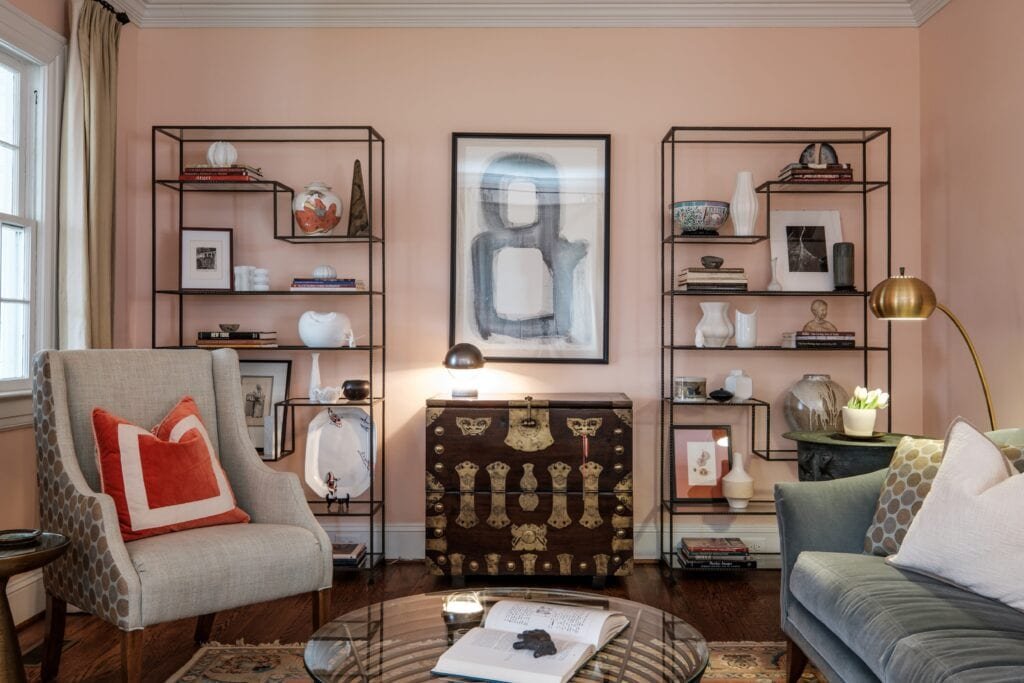
Orange patterned throw pillow - Cat French Design Chapel HIll
Similarly, the den is a skillful balance in color, with complementing and contrasting colors interwoven throughout. That deep teal behind the built-ins and above the windows takes most of the bold credit, but hints of orange tucked into the upholstery and decor layer in the perfect tone, depth, and contrast. Full of visual interest, this space is everything cozy, while still filled with so much personality and design flair.

Bright Dining
There's everything to love about this breakfast nook! In this room, the soft gray walls set the tone, letting that perfect, ripe orange hue steal the show. With statement wall art complemented by an artfully-placed central light fixture, it's the perfect punch of color and an infusion of design energy and style from every angle.

Orange pendent light - Cat French Design Chapel HIll
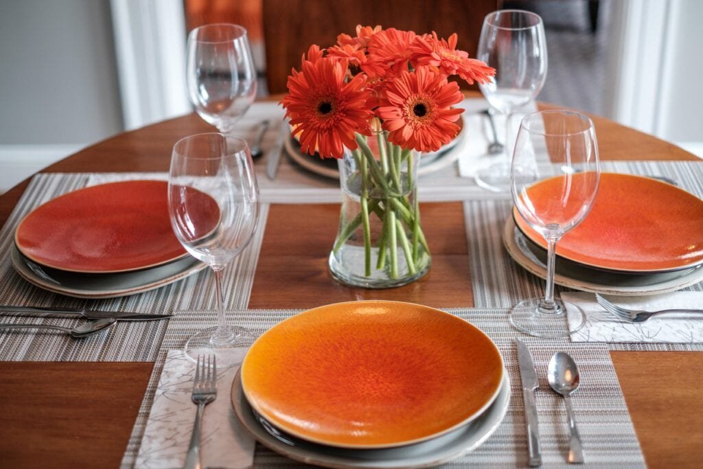
Orange accent plates - Cat French Design Chapel HIll
Big Color, Small Space
The powder room in this house has got so much style and charm, all centered around those beautiful coral hues. When considered carefully, a rich tone and pattern can live in a small space and have a gorgeous, polished effect. This petite bathroom was a perfect spot to showcase an incredibly unique, artistic wall choice. This koi wallpaper, paired with sleek chrome lighting and clean white porcelain fixtures came together beautifully- the perfect balance of movement, shape, and color. We love the peek you get from the hallway and the way it meets your line of sight from the beautiful coral front door.

Fish wall paper - Cat French Design Chapel Hill

amazing front entry - Cat French Design Chapel HIll
The Art of Orange Serenity
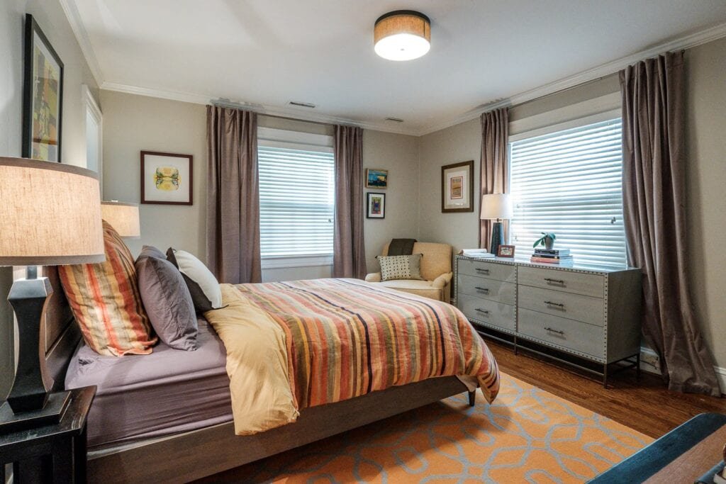
If there was ever a scene that showed orange at it's most versatile, one that we love is in the bedroom. You saw a little piece of the blue-and-orange guest suite up in the first photo, but this bedroom deserves a feature too. This room is so incredibly peaceful, but still every bit as unique as colorful as the rest of the home. Orange plays the role of a warmth-giving complement to deep grays and dusky plums. The chemistry is so perfect with the blend of tones and patterns (that rug!!). We can't get enough of the serene feel of the burnished + bright orange tones.
Creative Space
For this home, in particular, creative and inspired spaces were a must. Bringing the orange color palette throughout meant defining this home office space with an incredible blush rug that pulls your eye through the room. The soft fabrics, subtle upholstery, sleek desk and lighting, are the perfect combination. We also love the details in here- everything from the gorgeous floral pillow that brings in a bit more brightness to the unique orange-striped teapot.

Fall and Beyond
The orange color family is always a winning go-to for fall decor- and for good reason! But we're forever-fans of this tone for so much more. When placed with intention and purpose, an orange-inspired collection of hues can have a place in your home design all year 'round. From warm to bright to spicy, it can add an incredible element of style and interior design color-harmony that we never stop loving.
See more images from this beautiful project on our Portfolio Page! If you're digging all things Color-October, also check out some of our other color-love posts here and here. Have questions about designing your own color story? We're here to help! Give us a shout at hello@catfrenchdesign.com, or reach us via our contact page. For more of the happenings and goings-on of this busy team, follow us on Facebook or catch up with us on Instagram @catfrenchdesign!